Key Takeaways
- A website that looks good but generates no bookings usually has a decision-friction problem, not a design problem.
- Every extra click, page, or unclear next step between 'interested visitor' and 'booked session' loses a percentage of visitors.
- Generic templates are built to look impressive in a portfolio, not to move a stranger toward booking a specific service.
- A converting practitioner website answers three questions in the first screen: what you do, who it's for, and what happens if they click.
- Most practitioner websites don't need a redesign — they need fewer steps between arrival and booking.
In this article
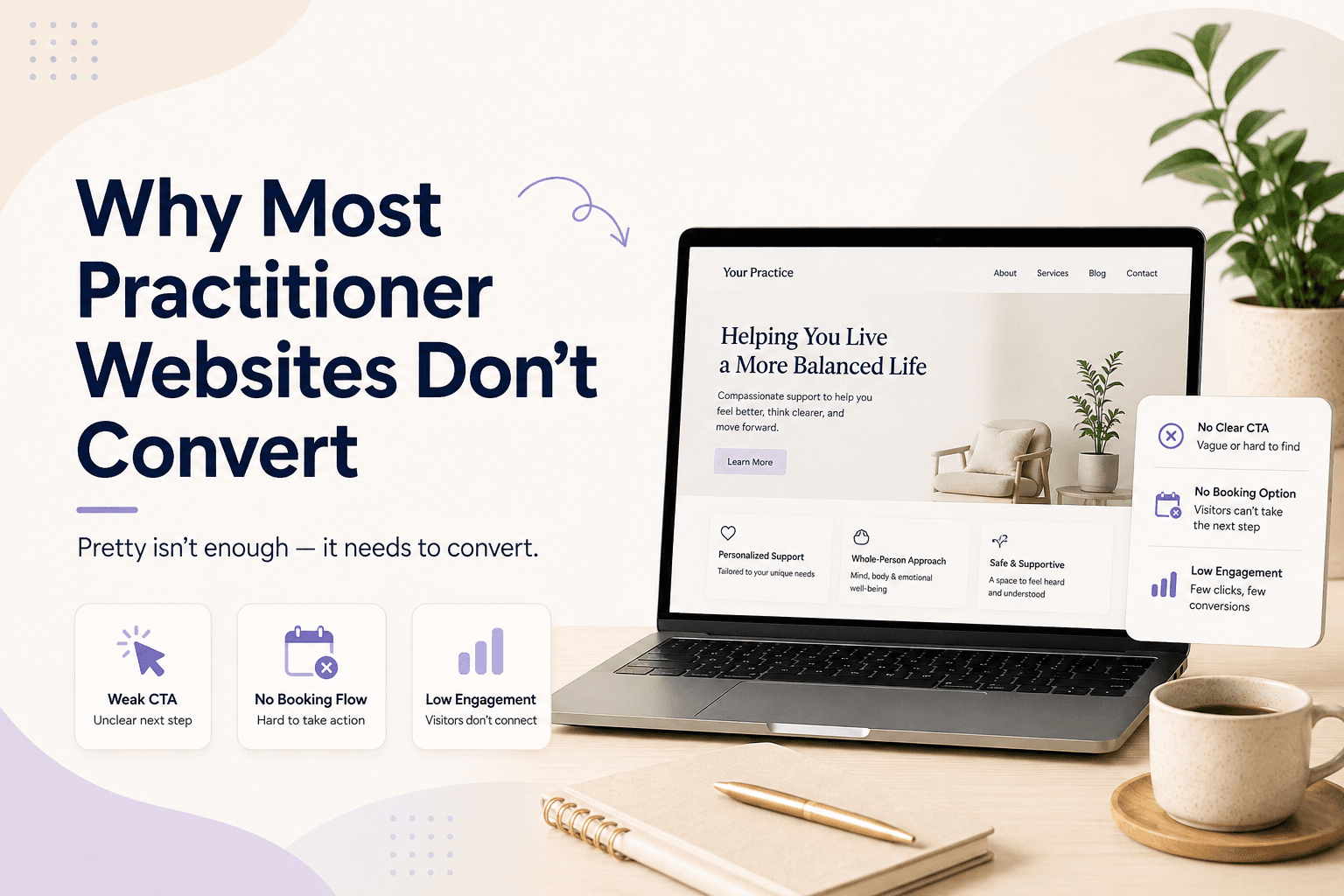
Every coach and therapist knows the feeling: a website that took real effort to build, traffic trickling in from search or a social bio link, and a booking calendar that stays stubbornly empty. The instinct is to blame the design. The design is rarely the problem.
Conversion problems are almost always structural — decisions the visitor has to make, and friction between showing interest and actually booking. Fix the structure, and the same traffic starts converting at a very different rate.
What "not converting" actually means
A website "converts" when a visitor takes the action you want — booking a call, buying a session, signing up for a waitlist. "Not converting" doesn't mean visitors dislike the site. Most of the time it means they got confused, distracted, or hesitant at some specific step, and left instead of pushing through it.
That's an important reframe. You're not trying to make the site more impressive. You're trying to find the specific step where interested people stall.
The real reason: too many decisions before booking
Every extra decision a visitor has to make before booking reduces the number who actually follow through. A homepage with five services, three navigation menus, and no obvious next step forces a stranger to figure out what to do — and most strangers won't do that work. They'll close the tab instead.
Compare that to a page with one clear offer and one clear button. The visitor doesn't have to decide what you do or what to click. They just have to decide whether they want it — which is a much smaller ask.
Why generic templates make this worse
Generic website templates are built to look impressive across every possible use case — photographers, consultants, coaches, retailers. That flexibility comes at a cost: nothing on the page is written or arranged for a specific decision a visitor needs to make.
A template built for "any small business" will never say, as clearly as it needs to, "book a free 20-minute call to see if we're a fit." That specificity is what converts — and it's exactly what generic templates are designed to avoid, in the name of broad appeal.
What a converting practitioner website actually does
A website that converts answers three questions immediately, without scrolling or clicking: what you do, who it's for, and what happens if the visitor takes the next step. Everything else — credentials, testimonials, longer explanations — supports that first screen, it doesn't replace it.
This is the same principle we cover in why your website should actually do something — a site that only describes you, without giving a visitor something to act on, isn't underperforming. It's working exactly as designed.
Pro tip
Fixing it without a redesign
Most of this doesn't require starting over. It requires removing steps: fewer pages between arrival and booking, pricing that's visible instead of hidden behind a "contact us" form, and one primary action instead of several competing ones.
The same logic applies whether someone lands on your homepage from search or from a single link in your bio. The fewer decisions between "interested" and "booked," the more of that traffic actually turns into clients. Merkora gives coaches and therapists a booking page built to remove exactly this kind of friction, without needing a designer or developer to rebuild it.
Frequently asked questions
How do I know if my website has a conversion problem?
The clearest signal is traffic without proportional bookings — people are finding the site but not acting on it. If you're getting visits from search, social, or referrals and few of them turn into inquiries or bookings, the site itself is the bottleneck.
Is a conversion problem usually about design?
Rarely. Most conversion problems are structural — too many pages between a visitor and booking, an unclear primary action, or pricing and next steps that are hard to find. A visually appealing site with the same structural problems will still underperform.
Should my homepage sell my whole practice or one specific offer?
One specific offer, ideally your easiest entry point — a discovery call, a single session, or your flagship course. A homepage that tries to represent everything you do usually convinces visitors of nothing in particular.
Do I need a professional web designer to fix this?
Not always. Many conversion problems are fixable by removing steps and clarifying the call to action, which doesn't require a redesign — just a platform that makes booking, pricing, and next steps easy to surface without custom development.